Approximating a sphere using CSS - and pumpkins!
The various ways to make something that more or less resembles a sphere out of triangles and trapezoids - with just HTML and CSS
Before I get to the main topic, please allow me to paint you a more detailed picture of how I got into 3D CSS:
I have been obsessed with 3D graphics all my life. An 80's kid, I'm not sure which I saw first: TRON or Dire Strait's Money For Nothing video, all I know is I was hooked, instantly. I watched the CGI revolution - Jurassic Park and Terminator 2 - with wide eyes and jaw on the floor. I witnessed games boldly fully embracing the third dimension - with the likes of Virtua Fighter and Quake.
Then, of course, is the 3D graphic software - which I didn't devote myself quite as much as I would've liked. Obsessed as I was with CGI as a teen, I didn't pursue it when I got online in the early '00s and suddenly had so many amazing, intuitive tools to pick from. It was only at work that I got into CAD - and while it did allow for some fancy experiments with surfaces, it was mostly for technical applications.
Case in point: to create a sphere you had to draw a semi-circle and spin it around a selected axis:

In contrast, artistic 3D modeling software like Sculptris would allow me to sculpt lifelike statues with tools that felt like actual fingertips:

But just as I was preparing for a deeper dive into 3D art, making my first steps in Blender, I found out that you could do 3D in CSS. Yes, that weird, fascinating and often deeply frustrating thing that you have to use to style your web pages has an intricate system of creating art in three dimensions.
A system that works nothing like Blender - and puts CAD to shame with the number of steps to create even the most basic solid primitive.
Investigating the topic, I stumbled upon this amazing blog article by Keith Clark. The man created a 3D FPS in (mostly) plain CSS. Ten years ago! His post details the intricacies of creating cubes and cylinders - to create the staples of boomer shooters: crates and barrels:

(image taken from the blog post, original image URL here)
All these were created out of plain <div> elements - the basic building blocks of HTML. You don't get a dedicated <cube> element that you could style. All you have at your disposal is a basic rectangular container - and you assemble 3D shapes by placing a series of appropriately sized containers in 3D space. You have to rotate and push each and every one of them around until they start to resemble the thing.
This got me so fascinated that I forgot all about Sculptris and Blender. The cylinders especially. They weren't perfectly smooth - but close enough.
If that's not good enough for you, look at this circle:

That's not a circle. It's a polygon with 64 sides. It merely approximates a circle.
I started exploring what more I could do from there, given that I took up webdev in 2018, and some things that Keith talked about as the bright future - such as blend modes - were already a fact.
Soon enough, I started thinking: what if I could create more complex shapes - like cones?
Or spheres!
...out of rectangles...
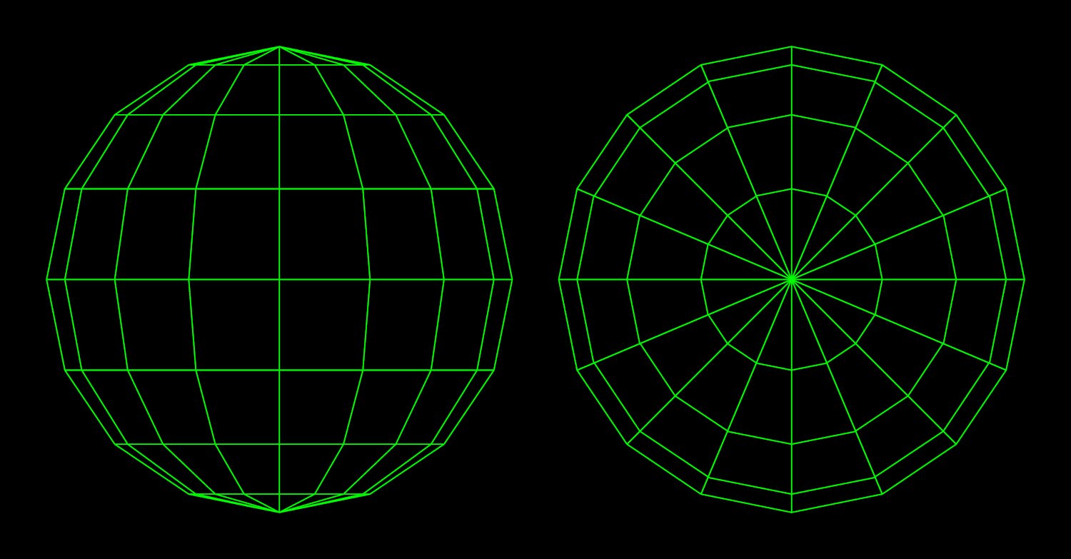
The most obvious idea seemed to be something like the globe from geography class - with a series of parallel horizontal circles, each narrower the farther it is from the equator, and vertical circles all the same size, converging on the poles. Something like this:

...except less round or smooth. We're only approximating the sphere - with the crudest shapes possible, imitating the most basic vector graphics. Forget curves and splines. What we're creating will have to look more like this if it's going to run smoothly.

See, HTML and CSS - as powerful as they are on their own these days - aren't exactly Unreal Engine. Whereas the latter can move around millions of polygons, shade and texture them and never break a sweat, your browser might make your CPU sweat with just 100+ objects. And our sphere exceeds that limit. It's based on a 16-gon, which means it consists of 16 slices (like those in an orange), each itself comprised of 8 faces. Our solid, therefore, is made of 128 trapezoid faces - formed by the intersecting meridians and circles of latitude - which, again, we'll have to cut one by one out from rectangular containers, then rotate and push into position using CSS. And math! Lots and lots of math - which is as hard for the CPU as it is for that squishy thing under your skull.
Terrifying and fascinating!
So there I was - and in order to get anywhere from there, some 20 years after high-shool I had to relearn trigonometry. Sines, cosines and the lot. I'll spare you the exact details of figuring out the formulas for what I needed and transplanting the basics of classic geometry onto the constraints of CSS syntax - and PHP, while we're at it - because that's a whole other rabbit hole. Eventually, I was cranking out sphere after sphere. Originally, I would use SVG - which I got really comfortable with - but would eventually transition to clip-path.
For the kicks, I even made one out of borders:
...and (much later) out of conic gradients:
This paradigm - a series of trapezoids starting out as triangles at one pole, going via the equator and converging again on the other pole - was neat and intuitive enough, even if I had some slip-ups along the way and needed to rethink the structure a bunch of times. But, as much as I liked it, I had a major issue with it:
The lines converging at the poles meant that the facets that they formed got ever smaller while contributing less and less to the geometry.
This forced me to rethink my approach to the basic shape used for the facet - the trapezoid. I thought of vector graphics - where the basic unit is the triangular vertex, and a trapezoid is just two conjoined vertices combined:

It would have made little sense to split a trapezoid into two triangles to create a geometry like above. But what if you rotated every other circle of latitude by half a step - 11.25 degrees ( 0.5 * 360degrees / 16 ) - so that, instead of straight lines running from the poles outward, the meridian lines would have to zigzag to connect the tips, thus forming neat triangles:

This seemed not just a step up from the previous paradigm. It was just perfect for the 3D Jack O' Lantern that I wanted to make for Kevin Powell's 3D CSS challenge: with sharp teeth and triangle-shaped cutout eyes. What's more, it let me lower the facet count, given how much was "carved away":
In reality, though, what CPU usage I saved there, I now had to transfer into calculating the bright orange facets of where the cutouts pierced the virtual flesh of the CSS pumpkin. In keeping with the Halloween spirit, this was a nightmare to figure out and coordinate, as was the faux texturing, done with gradients, which ran in straight lines like it would in my primary sphere, not in zigzags, like my facets did.
Also, my facets weren't actual vector vertices, they were just imitating those, just as the trapezoids were. Splitting the trapezoids in two would've made sense in a vector-based system. Here, I just doubled the facet count.
So can you blame me for going back to my original paradigm for my subsequent Hallooween's Jack O' Lantern?
This made the texturing way easier, and so I focused on that. Even so, I didn't quite achieve what I'd set out to do: I had to settle for linear gradients instead of conic gradients. Promised myself I'd keep trying and improve - next year!
And so I did!

You're probably scratching your heads right now. Isn't this the same basic globe-like sphere, with meridians and circles of latitude? Yes - and no. The bases for both these spheres - the old one and the new one - look the same:

Except they aren't the same. Notice that the right 16-gon is rotated by half a step - 11.25 degrees - similarly to what we did with every other circle of latitude in the second paradigm. So what you get both at the poles and the equator aren't sharp tips, it's flat surfaces. This results in the faces at the equator being perfect rectangles (left), not trapezoids (right):

Furthermore, the tips at the poles are no longer spiky, 16-gon-based pyramids. These triangles form a perfectly flat 16-gon. Which means we don't have to use 16 triangle-shaped containers to form a 16gon, we can just as well use a single, 16-gon-shaped div (one for each pole). This saves us a lot of computational power. We can even go as far as just rounding out our square container into a basic circle with border-radius: 50%

How does that make it a better material for a Jack O' Lantern?
It doesn't, really. Again, the savings weren't as great as I'd have expected. The flat pole gets skipped altogether, as the Halloween pumpkin is usually gutted through the top of the head.
And so, the quest for the optimal approximation of the sphere continues - and Jack O' Lantern might not be the ideal test subject.
