Particles & spiral patterns in CSS: part I
Dots, sparks & marbles arranged along serpentine paths - with some help from CSS and HTML preprocessors for your convenience.
This week Codepen, known for its fun weekly coding challenges, rolled out one that made me drop everything and code, code, code. This week it's all about particles - i.e. large amounts of small, identical/similar objects, such as droplets of water, sparks, marbles or dust - usually in the context of them being subjected to forces such as gravity, wind, etc. But I decided to try something else that fascinates me.
Spirals!
Serpentines, squiggles and all sorts of non-linear, twisted paths. Something that CSS isn't really known for. It's the domain of SVG, with its fascinating system of curves. Which you indeed can bring over to CSS via clip-path: path() - but it isn't animatable (last time I checked, at least).
Either way, there are ways to squeeze that flowy aesthetic out of pure CSS. Let it be your Spirograph!
Over the next few days I'll show you how to make some of my favorite simple, two-dimensional serpentine shapes.
Today let's start with the most basic of them:
Linear squiggle
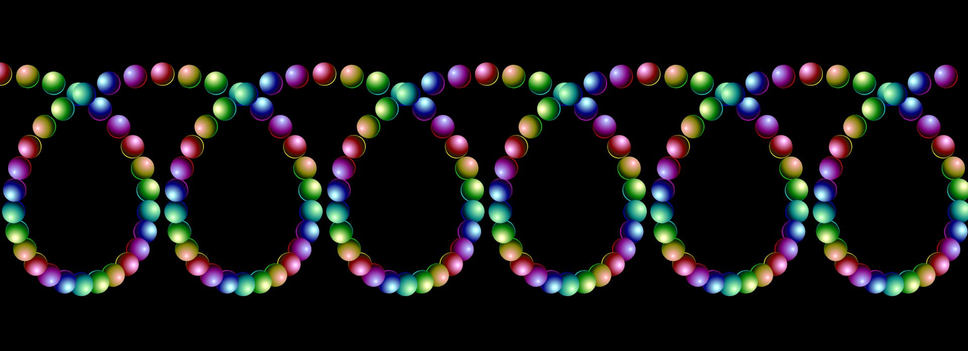
All the pens I made for the challenge are in 3D - but the basic idea behind them is simple, and the only difference is the axis of rotation. In 2D it'd look like this:

What's happening here is we have a row of 180 tall, narrow div with a candy/marble at the top. Each of them is incrementally rotated by a multiple of 12degrees depending on its order in the sequence: the first one - by 12deg (1*12deg), the second - by 24deg (2*12deg), the third - 36deg (3*12deg), etc.
The HTML setup is as simple as it gets:
<div class="chain">
  <div class="segment"></div> <!-- we'll need 180 of those -->
</div>
If you're using a code editor with Emmet, all you need to do to spawn as many divs as you want is type:
.segment*180
and press either Enter (VS Code) or Tab (Codepen) and that is it. You could use Pug - a preprocessor I love for its indentation-based syntax, and have used for the demo above - but truly, Emmet is the most straightforward way to do this.
With that out of the way, we can now supply the style. We'll be using SCSS - which is a midpoint between Sass and plain CSS, with the fun functionalities of the former but with classic CSS syntax that doesn't rely on indentation.
First the containers:
body {
  margin: 0;
  background-color: #000; /* hex code for the color black */
  height: 100vh; /* so that the body takes up the entire viewport's height */
  display: grid; /* we'll want to center the content */
  align-content: center;
  overflow: hidden;
}

.chain {
  display: flex;
  flex-direction: row; /* non-essential, but will come in handy if/when declaring @media mobile views */
  position: absolute; /* the container floats freely, independent of any other objects */
  inset: 25vh 0; /* it takes up 50% of container height, at its center, and 100% of its width*/
  justify-content: space-between; /* we'll want to space out the anchors */
}
Now for the main actors:
.segment { /* that's our anchor */
  --particles: 180; /* a CSS variable defining the number of particles */
  height: 100%; /* notice we don't really need the width */
  position: relative; /* we need this so that our subordinate pseudo-element takes this as its point of reference in terms of measurements */
  rotate: calc(var(--turnStep)*12deg); /* the variable for rotating the .segment based on its order in the sequence will be defined in a for-loop later on */
  display: flex; /* for centering the content in the X axis, as done in the following line */
  justify-content: center;
}

.segment::before { /* that's the actual single particle */
  content: ''; /* no text */
  position: absolute; /* makes it look at its direct parent as a point of reference */
  width: 5vmin; /* 5% of the smaller viewport dimenstion; just a stylistic choice, make it more or less as you like */
  aspect-ratio: 1; /* makes the height match the width 1:1*/
  border-radius: 50%; /* turns the div into a circle */
  background-color: red; /* placeholder - for now */
}
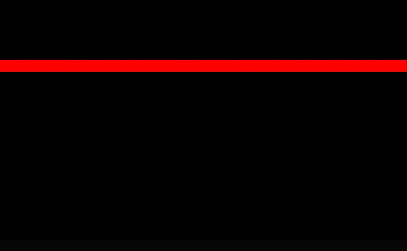
At this point you should be seeing the whole chain as a single, thick horizontal line:

The red dots form a single straight line because the rotation has not been applied. That's because we haven't set up the variable specifying the ordinal number of each dot in the sequence.
We could do this manually in CSS - but declaring each :nth-child and its variable would take ages. Luckily, SCSS lets us run a single loop that will do it for us in split-second.
@for $i from 1 through 30 {
  .segment:nth-child(30n+#{$i}) {
    --turnStep: #{$i};
  }
}
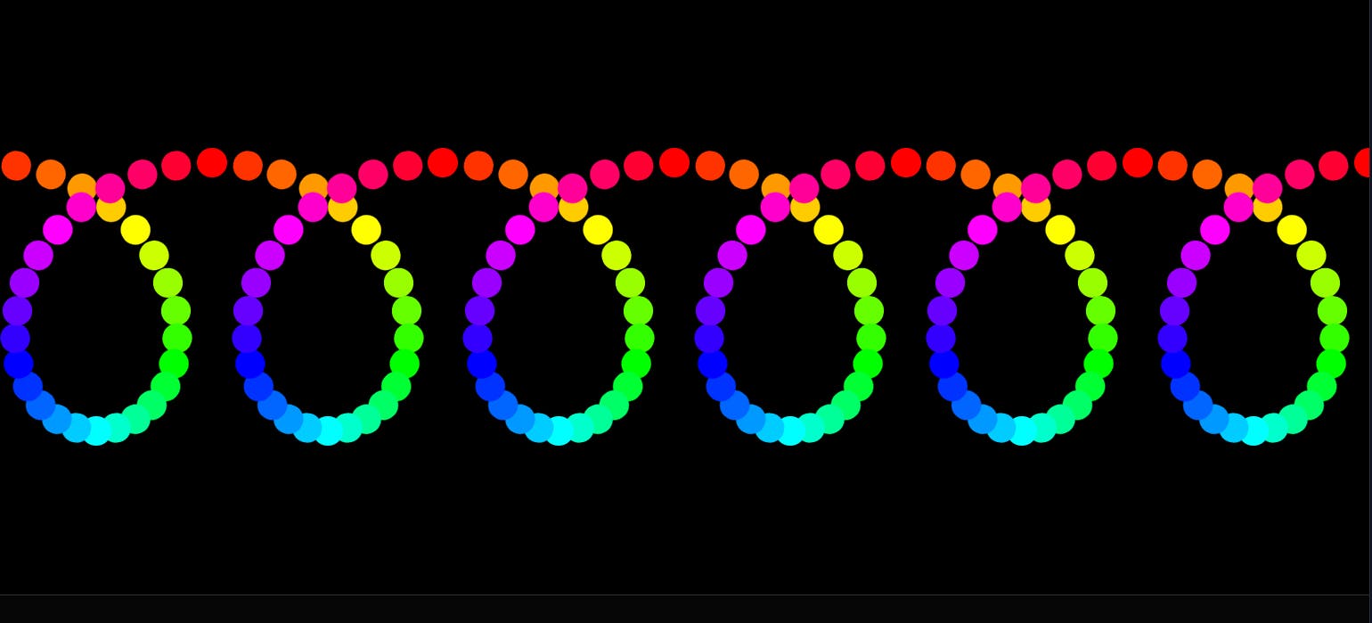
This assumes that we want our serpentine of 180 particles to have 6 loops - hence the 30 (180/6). The particles' number will be incremented from 1 until 30, and then back from 1 for as long as the serpentine lasts. With that, each subsequent segment now knows to incrementally by multiplying its --turnstep by 12deg. It makes a full 360 loop every 30 segments:

It'd also be nice if we could make the serpentine itself a little more colorful. Luckily, we can - using the same value that we applied to rotation:
calc(var(--turnStep)*12deg)
We can declare colors using an angle. For this we need to utilize the hsl() functional notation. HSL is an acronym for Hue, Saturation, Lightness - the three parameters it uses to describe colors. Hue is the one we are most interested in, since that's the one that takes in angles - as if picking the colors from rainbow spectrum of red, yellow, green, cyan, blue, fuchsia and back to red:

Their values are as follows:
red: 0deg
yellow: 60deg
green/lime: 120deg
cyan: 180deg
blue: 240deg
fuchsia: 300deg
red: 360deg
The last one might seem redundant. But what this means is that the colors, as it were, run in circles: the hue beyond 359deg is still a perfectly valid color: whatever its value is - say, 420 - the code subtracts 360 (or its multiple) from it. 420 is the same as 60 - ergo, yellow. Similarly, -60deg is fuchsia.
Knowing that, we now can declare our color using hsl:
.segment::before { /* that's the actual single particle */
  content: ''; /* no text */
  position: absolute; /* makes it look at its direct parent as a point of reference */
  width: 5vmin; /* 5% of the smaller viewport dimenstion; just a stylistic choice, make it more or less as you like */
  aspect-ratio: 1; /* makes the height match the width 1:1*/
  border-radius: 50%; /* turns the div into a circle */
  background-color: hsl(calc(var(--turnStep)*12deg) 100% 50%); /* the colors run through all colors of the rainbow within a single loop */
}
This should produce a rainbow-tinted serpentine:

This is the most basic, simple serpentine. The fun thing about SCSS is that it lets you easily modify the spiral. Let's say you'd like to have more particles - or more (or fewer) loops. Or for the colors to go through the hues of a rainbow across the whole serpentine, not a single loop.
Of course, that'd be too much for a single blog post - so instead have this demo to play with:
You can play around with the number of particles and loops. Make sure that the number of $particles in SCSS matches the respective property in Pug (the HTML preprocessor).
