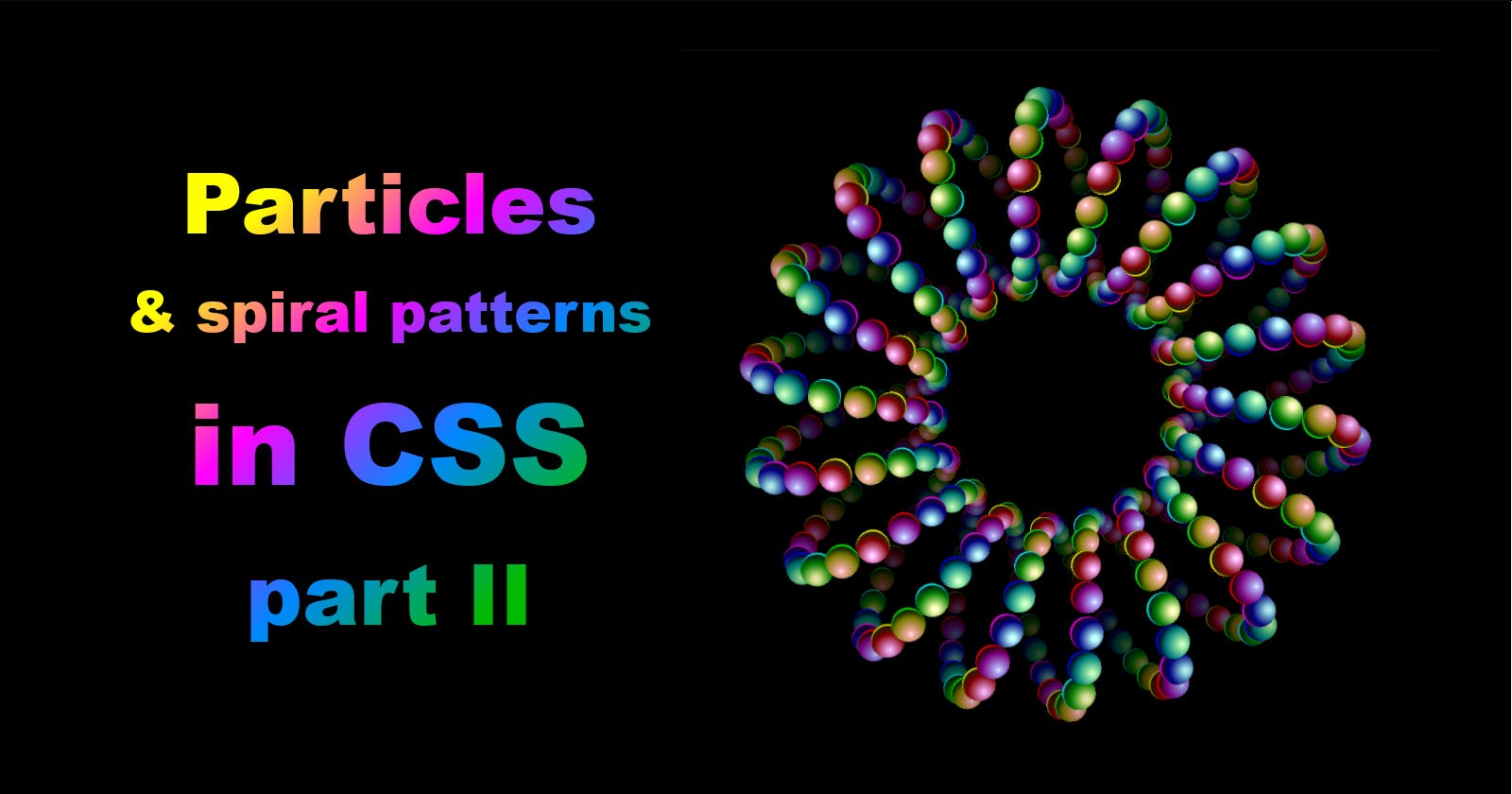
Particles & spiral patterns in CSS: part II
Imitating the spirograph with HTML and CSS (and their preprocessors, Pug and SCSS)


The week of Codepen's particle challenge is up - but I'm far from done obsessing over particles and serpentines. In Friday's Part I I merely scratched the surface, showing you my first demo for this week's challenge:
and based on that, showed you how to draw the most basic 2D serpentine pattern:
To reiterate: the dots are deposited in equal intervals by a line spinning around its center point and also moving in a straight line - like so:

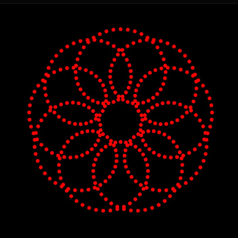
For my second demo I decided to push it a little further in terms of complexity:
and then tweaked it a bit:
It was a headache to coordinate - and now might be a headache to wrap your head around ;)
Let me break down what's happening here - which is only a slight modification of my original linear serpentine. This time, however, instead of traveling along a straight line from one end to another, the pivot point is stationary. It is at the center of the viewport. Also, the line that spins around like the hand of a clock isn't the one drawing. It is merely a join for another line, and it is that one that deposits the dots as it spins while being spun itself:

As complex as that sounds, the HTML setup for it is almost as simple as for the linear serpentine:
<div class="spiroGraph"> <!-- the container for our serpentine -->
  <div class="arm"> <!-- the spinning joint anchored at the center of the viewport -->
    <div class="foreArm"></div> <!-- the joing that spins while also being spun -->
  </div>
</div>
We'll need to spawn a large number of the .arms - and like last time, the easiest way to do that is using Emmet - which is built into VS Code and Codepen. Instead of typying up the entire HTML markup above manually, just type:
.spiroGraph>.arm*180>.foreArm
and press Enter (VS Code) or Tab (Codepen) - and witness 180 .arms, each with a .foreArm, spawned instantly.
That does it for HTML - so let's go over to our style sheets. As before, let's use SCSS - which will allow us to write most of our code just as we would in plain CSS, but will let us use for-loops for quickly styling each of our 180 .arms and .foreArms, and also declare variables.
First, let's set up the scene:
$particles: 360; /* an SCSS variable defining the number of particles across the whole serpentine; not the same as a CSS variable */

body {
  margin: 0;
  background-color: #000; /* hex code for the color black */
  height: 100vh; /* so that the body takes up the entire viewport's height */
  display: grid; /* we'll want to center the content */
  align-content: center;
  overflow: hidden;
  font-size: .8vmin; /* setting font size to be .8 of 1% of the shorter viewport dimention (height on desktop, width on mobile  */
}

.spiroGraph {
  position: relative; /* thus the container will be the point of reference for its child, the .foreArm */
  display: flex;
  height: 100em; /* using font size as a unit for object size - making it 80% of the shorter vieport dimension */
  justify-content: center; /* we'll want the .arm to be placed at the center of the horizontal axis */
}
Now for all the moving bits:
.arm {
  --particles: #{$particles}; /* a proper CSS variable that takes its name and value after its SCSS counterpart */
  position: absolute; /* the container floats freely, independent of any other objects */
  bottom: 50em; /* the bottom end of the .arm is anchored at the center of the viewport */
  height: 30em; /* since there's got to be room for the .foreArm, we don't want it to be be 50em - but can't be less than 25em */
  transform-origin: bottom; /* its pivot point is located at its bottom end */
  rotate: calc(360deg/var(--particles)*var(--turnStep)); /* it does a full 360 over 360 particles - ergo each step is 1deg - but this formula will let you tweak that number  */
}

.foreArm {
  --loops: 9; /* we'll want our serpentine to have 9 loops */
  position: absolute;
  bottom: 100%; /* its bottom will be where normally its top would be; thus it'll be anchored at the tip of the .arm */
  height: 20em; /* 50em (half of the viewport's height) minus the height of the .arm */
  /* also note we didn't declare the width for either - which is why we do this: */
  display: flex;
  justify-content: center; /* the .foreArm's child WILL have width, and we need to cente it */
  transform-origin: bottom; /* its pivot point is located at its bottom end */
  rotate: calc(360deg/var(--particles)*var(--loops)*var(--turnStep)); /* it has to make 9 loops of full 360 rotations, ergo it has to spin 9 times faster than the foreArm: 1deg x 9 = 9deg */
}

.foreArm::before {
  content: ''; /* no text */
  position: absolute;
  width: 2em;
  aspect-ratio: 1; /* the height matches the width */
  border-radius: 50%; /* our particle will be round */
  background-color: red /* for now */
}
Since we haven't set up the variable of --turnStep for each .arm:nth-child, no rotation was applied - so what you're probably seeing right now is a single red dot in the middle at the top of the container;

Let's fix that - and quickly loop over the variable:
@for $i from 1 through 360 {
  .arm:nth-child(#{$i}) {
    --turnStep: #{$i};
  }
}
Now that's more like it. Are you seeing a spiral of 360 red dots?
We can just as easily add some more color to it - by applying the same degree-based formula that we did to rotation.
.foreArm::before {
  content: ''; /* no text */
  position: absolute;
  width: 2em;
  aspect-ratio: 1; /* the height matches the width */
  border-radius: 50%; /* our particle will be round */
  background-color: hsl(calc(360deg/var(--particles)*var(--turnStep)) 100% 50%); /* the color will cycle through the full spectrum of colors of the rainbow */
}
That should make our serpentine look like this:

And thus we get a proper spirograph-like serpentine. But again, this is really basic, and there's a whole lot more you can do with it. You can make more - or fewer - particles as you like (as long as you make sure your HTML and your SCSS have the same number of objects). Or experiment with dot sizes - or arm lengths and centers of rotation.
To make things easier, here's a live demo on Codepen that you can tinker with. For instance, see the madness that happens when you just reverse the direction of rotation on the .foreArm - like this:
rotate: calc(-360deg/var(--particles)*var(--loops)*var(--turnStep)); /* notice the minus before 360deg - that makes it assume the negative value, and this reverse the direction of rotation */
Have fun - and come back next time for another crazy loop done in (almost) pure HTML and CSS.