Particles & spiral patterns in CSS: part III
The Archimedean spiral - with HTML and SCSS

If you thought my obsession with particles and curves waned over the past two weeks since the last post, then I'm here to disappoint you. In Part 1 and Part 2 I covered linear and circular serpentine patterns. But for me where it's really at is spirals:
OK, not the best example, since it puts too much emphasis on my beloved trigonometry - so let's take away the irrelevant third dimension.
This is a spiral. An Archimedean spiral, to be exact. One in which the dots are deposited by an arm pivoting around the center of the screen - and steadily getting shorter as it goes.
This produces a spiral for a number of loops until it ends right in the center.
Our HTML setup is going to be as basic as it gets:
<div class="archimedean"> <!-- the container -->
  <div class="arm"></div> <!-- the depositior of the dots -->
</div>
To recreate the spiral above, we're only going to need 300 of .arm (5 loops, each consisting of 60 dots). If your code editor supports Emmet, all you'll need to type is:
.archimedean>.arm*300
and press either Enter or Tab for it to instantly spawn 300 copies of <div class="arm"></div>
Our CSS/SCSS is going to be pretty similar to what we used for our circular serpentine patterns:
$particles: 300; /* an SCSS variable defining the number of particles across the whole serpentine; not the same as a CSS variable */

body {
  margin: 0;
  background-color: #000; /* hex code for the color black */
  height: 100vh; /* so that the body takes up the entire viewport's height */
  display: grid; /* we'll want to center the content */
  place-items: center; /* centers the contents of the div horizontally and vertically */
  overflow: hidden;
  font-size: .8vmin; /* setting font size to be .8 of 1% of the shorter viewport dimention (height on desktop, width on mobile  */
}

.archimedean {
  position: relative; /* thus the container will be the point of reference for its child, the .foreArm */
  display: flex; /* for centering the content */
  height: 100em; /* using font size as a unit for object size - making it 80% of the shorter vieport dimension */
  aspect-ratio: 1; /* the width is the same as the height */
  justify-content: center; /* we'll want the .arm to be placed at the center of the horizontal axis */
}
The arm depositing the dots is going to be even simpler:
.arm { /* the single joint depositing the dots */
  --particles: #{$particles}; /* a proper CSS variable that takes its name and value after its SCSS counterpart */
  --loops: 5;
  position: absolute; /* the container floats freely, independent of any other objects */
  bottom: 50em; /* the bottom end of the .arm is anchored at the center of the viewport */
  height: 50em; /* since there's got to be room for the .foreArm, we don't want it to be be 50em - but can't be less than 25em */
  width: 5em; /* that's for defining the width of the dot */
  transform-origin: bottom; /* its pivot point is located at its bottom end */
}

.arm::before { /* the dot */
  content: '';
  position: absolute;
  inset-inline: 0; /* defines the width of the dot - at 100% of the .arm's width */
  aspect-ratio: 1; /* the height matches the width */
  background-color: red; /* placeholder color */
  border-radius: 50%; /* it's a dot, so it needs to be perfectly round */
}
At this point, you should be seeing a single red dot:
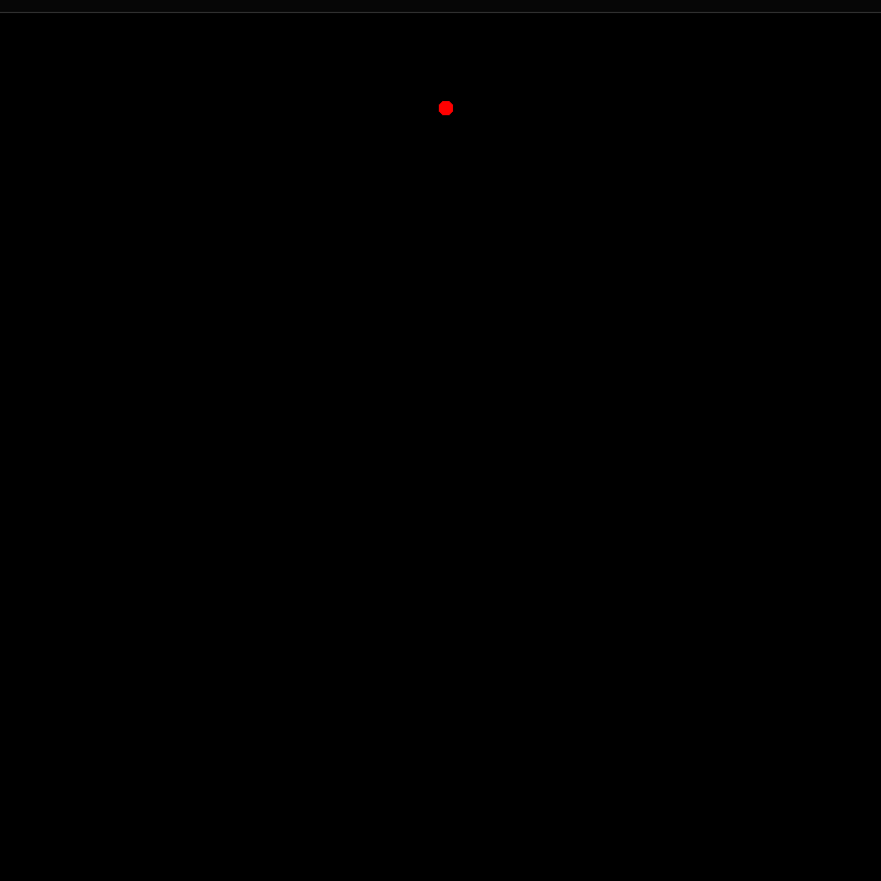
All the dots are there, but they're stacked on top of one another - by virtue of having the position: absolute, which allows them to ignore the presence of other divs - so they appear as one, at the top center of their container. They have also not been rotated yet - so let's do that. Before we spin them, we need to define the increment of rotation for each of the 300 dots:
@for $i from 1 through $particles { /* in our case that's 300*/
  .arm:nth-child(#{$i}) {
    --turnStep: #{$i};
  }
}
Now, at the bottom of .arm's code we can add the instruction for rotation:
.arm {
  --particles: #{$particles};
  --loops: 5;
  position: absolute;
  bottom: 50em;
  height: 50em;
  width: 5em;
  transform-origin: bottom;
  rotate: calc(360deg/var(--particles)*var(--turnStep)*var(--loops));
  /* it performs 5 loops of 360 degrees over 300 particles - ergo, each loop is 60 particles, each rotated incrementally by 6deg - but this formula will let you tweak that number  */
}
This should result in this neat circle of tightly packed red dots:

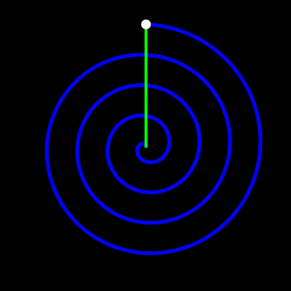
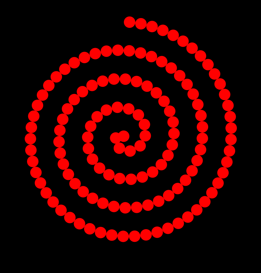
But that's not what we wanted. We wanted a spiral of five loops, ending in the middle.
For the record - all 300 dots are there (as we've already established). It's just that the five loops are on top of each other (just as the dots appeared as one before we rotated them). For us to see them we need to steadily shorten the arm.
We'll need to tweak the height:
.arm {
  --particles: #{$particles};
  --loops: 5;
  position: absolute;
  bottom: 50em;
  height: calc(50em*(1 - var(--turnStep)/var(--particles))); /* each new instance of the .arm will be incrementally shortened by 1/300 of the original height */
  width: 5em;
  transform-origin: bottom;
  rotate: calc(360deg/var(--particles)*var(--turnStep)*var(--loops));
}
This is much more like it:
But still not quite: the dots get progressively more cramped as the loops go, so much so that towards the end they look like a single thick line.
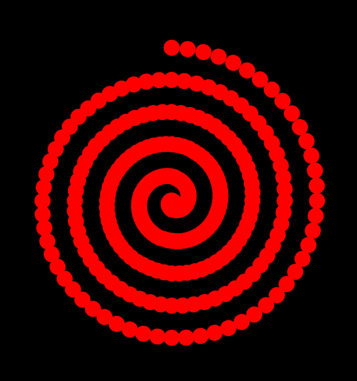
There isn't much we do about the spacing of the dots. The math for that would be too complex for this post. This would be much easier to do in SVG - where the spacing is handled automatically by just two parameters in the "stroke-dashArray" attribute, which would give us this:
But we can't do that. Plus, that's not 300 dots, it's simply however many identical dots it could squeeze in along the curve. Instead, what we could do in CSS is make use of our --turnStep variable. Just as we defined the rotation increment and the progressive shortening of the .arm, so now we can shrink the dots.
.arm::before {
  content: '';
  position: absolute;
  inset-inline: 0;
  aspect-ratio: 1;
  background-color: red;
  border-radius: 50%;
  scale: calc(1 - var(--turnStep)/var(--particles));
}
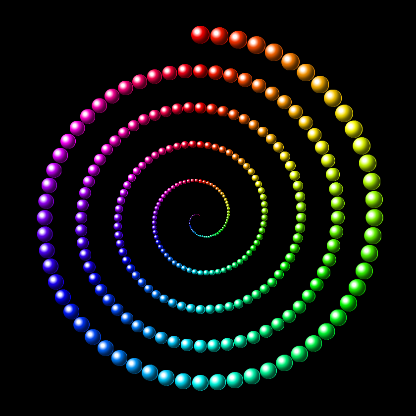
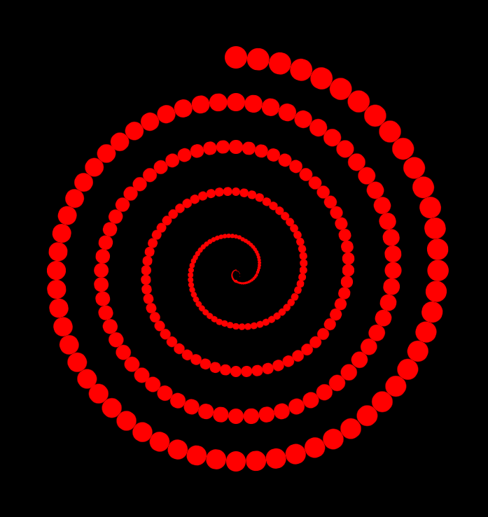
This should finally give us a basic approximation of what we came here for: a proper Archimedean spiral of dots shrinking as the spiral progresses toward the center:
Now let's add some 3D to the scene by styling the dots into proper glossy orbs.
First, the light: a white spotlight, slightly off-center:
.arm::before {
  content: '';
  position: absolute;
  inset-inline: 0;
  aspect-ratio: 1;
  --color: red; /* the value is a placeholder */
  background-image: radial-gradient(at 33% 33%, white, var(--color) 50%); /* notice that we switched from background-color to background-image for this one */
  border-radius: 50%;
  scale: calc(1 - var(--turnStep)/var(--particles));
}
Then, how about some shading on the opposite end:
.arm::before {
  content: '';
  position: absolute;
  inset-inline: 0;
  aspect-ratio: 1;
  --color: red;
  background-image: radial-gradient(at 33% 33%, white, var(--color) 50%);
  border-radius: 50%;
  scale: calc(1 - var(--turnStep)/var(--particles));
  box-shadow: inset -1em -1em 1em #000b; /* the shadow is inside rather than outside the dot, it's offset by 1em vertically and horizontally, and blurred */
}
...and some subtle backlight for contrast:
.arm::before {
  content: '';
  position: absolute;
  inset-inline: 0;
  aspect-ratio: 1;
  --color: red;
  background-image: radial-gradient(at 33% 33%, white, var(--color) 50%);
  border-radius: 50%;
  scale: calc(1 - var(--turnStep)/var(--particles));
  box-shadow: inset -1em -1em 1em #000b;
  border-right: 1px solid var(--color);
}
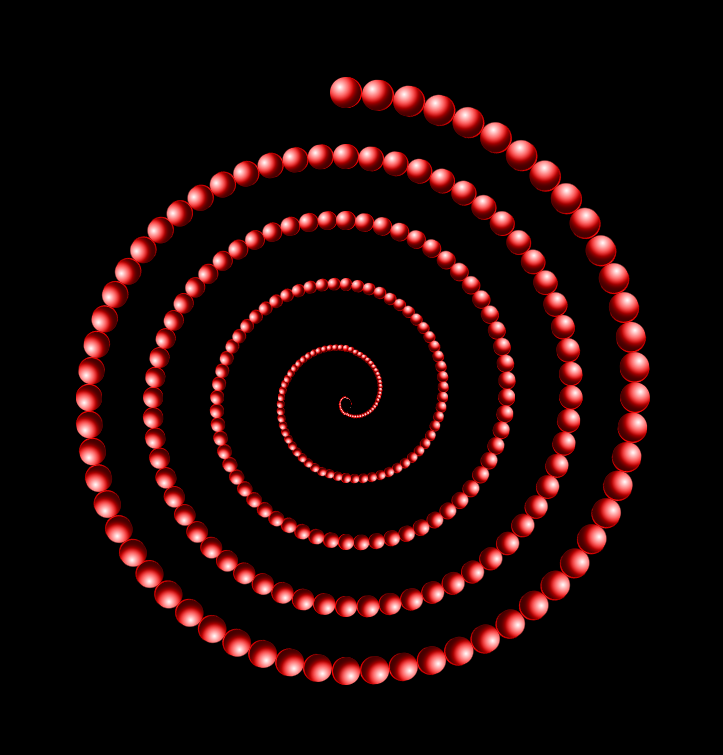
This looks nice - but a little off. Notice how the shading is inconsistent? For the orbs at the top of the spiral, it seems to be coming from top left, and for those at the bottom - from bottom right. That's because the orbs rotate with the arm, and with them so does the shading. So we need to counteract that - by rotating the orbs by the same degree, but in the opposite direction:
.arm::before {
  content: '';
  position: absolute;
  inset-inline: 0;
  aspect-ratio: 1;
  --color: red;
  background-image: radial-gradient(at 33% 33%, white, var(--color) 50%);
  border-radius: 50%;
  scale: calc(1 - var(--turnStep)/var(--particles));
  box-shadow: inset -1em -1em 1em #000b;
  border-right: 1px solid var(--color);
  rotate: calc(-360deg/var(--particles)*var(--turnStep)*var(--loops));
}

Now all we need to do is add some color to it - by replacing the placeholder with something that uses the rotation increment:
.arm::before {
  content: '';
  position: absolute;
  inset-inline: 0;
  aspect-ratio: 1;
  --increment: calc(360deg/var(--particles)*var(--loops));
  --color: calc(var(--turnStep)*var(--increment));
  background-image: radial-gradient(at 33% 33%, white, hsl(var(--color) 100% 50%) 50%);
  border-radius: 50%;
  scale: calc(1 - var(--turnStep)/var(--particles));
  box-shadow: inset -1em -1em 1em #000b;
  border-right: 1px solid var(--color);
  rotate: calc(-360deg/var(--particles)*var(--turnStep)*var(--loops));
}
And so, after many twists and turns, here we are at last:

But again, this is just the beginning of the fun. For instance, if this isn't trippy enough on its own, try to spin it.
.archimedean {
  position: relative;
  display: flex;
  height: 100em;
  aspect-ratio: 1;
  justify-content: center;
  animation: spin 6s linear infinite;
}

@keyframes spin {
  100% {
    rotate: 360deg;
  }
}
Also, remember how the dots looked like a single thick line when smushed together the closer they were to the middle. You could extend that effect to the whole spiral by spawning more of the dots. A thousand or two maybe? Since at such quantities the intricacies of the shading would be lost, you could try different things instead:
And lots of other things - so see you next time!


